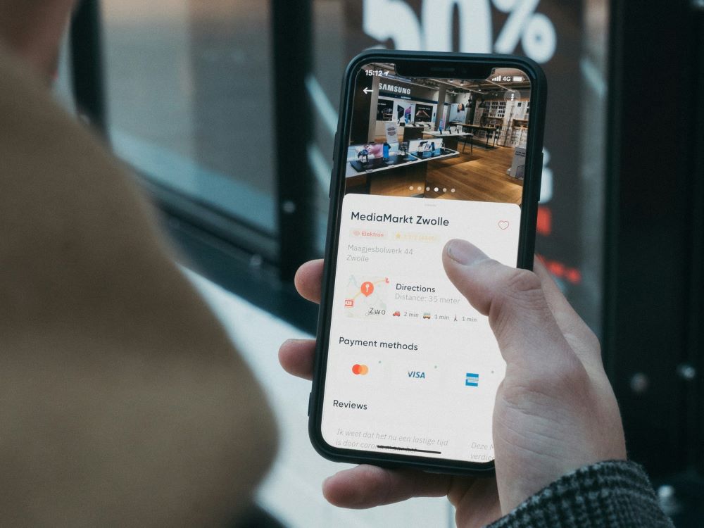
A recent report based on Google and PayPal UK search and transaction data estimated that smartphone shopping will account for two thirds of UK eCommerce by 2020.
That will be a whopping £43bn worth of UK purchases conducted on mobile – triple the value of eCommerce in 2016, which stood at £13.5bn.
Alex Mathers from OC&C Strategy Consultants, who analysed the data, commented that “retailers that fail to adapt [to mobile eCommerce] will find themselves haemorrhaging customers. Right now, the average UK retailer’s strategy should be mobile first – in a few years, it may well be mobile only.”
If you still haven’t optimised your business website for mobile eCommerce, you need to do it as soon as possible. Here are some tips to help you design a great mobile site.
A clear call to action
Mobile customers shopping on the go tend to make very quick decisions and if they find your site confusing, it’s taking too long to load, or it’s not clear what action they should take next, they’ll quickly leave – and probably never return.
A clear call to action (CTA) should be visible wherever they are browsing on your site. The call to action should be easily noticeable as well as clearly stating what will happen when the action is taken. For example, if you want someone to sign up to your mailing list, then you should tell them where on your site to go to enter their email details, and what they can expect to happen when they submit the form.
Use space wisely
There is obviously much less space available on a mobile than on a desktop screen. It is particularly important to consider use of space when you have a responsive site, where the mobile version is a ‘scaled’ version of the desktop site, because you will need to check that any copy or graphics that you’ve added to the website fit properly in the mobile version.
Less is definitely more when it comes to mobile websites and you should try and simplify the design as much as possible. Excessive or flashy features do not work well on mobile, and high resolution graphics or photos are not recommended as they can take a long time to download. Try and keep content to a minimum, so that the site does not feel cramped on a small screen.
Make the design finger friendly
The elements on your website need to be large enough so that visitors can click on and activate them with their fingers. There’s nothing more frustrating than not being able to close an annoying popup because the close button is too small to click!
Make sure all the elements on your site that customers might click, are obvious enough and big enough for visitors to click with their fingers – whether that’s buttons, links, popups, photos or graphics.
Test it on multiple browsers and devices
It’s important to test your website on multiple devices, because what may look good on one device, may look terrible on another. Testing your site on various physical devices isn’t a realistic option due to the time and expense of buying the latest models, but fortunately emulator websites can help you to see how your site renders across various devices and screen sizes, whether that’s a mobile, tablet, laptop or desktop.
Check page load times
As mentioned previously, certain elements such as high definition photos and graphics can take a very long time to download on a mobile device. Make sure that you compress images when uploading them to your site, so that they are not too large and load quickly. Elements like widgets and popups should be kept to a minimum as these too can slow down load times.
Mobile site speed is very important because some visitors will be using a slower connection and they will simply click away if your site is taking too long to load.
Here at WTS Technologies we are specialists in designing mobile responsive eCommerce websites. Contact us today for a quote!


